The Theatre Centre
The Theatre Centre is an arts and community hub with extensive programming and activities. The challenge was to create a website that clearly conveyed what they do, and was easy for people to use.
WEBSITE REDESIGN
Timeline: May 2020 - October 2021 (combination of part-time work and intensive design sprints throughout the year)
Budget: $3,000 - $5,000
Role: UX Designer, Copy Writer, Branding, Project Manager
Tools: Figma, Adobe Illustrator, Adobe Photoshop, Wordpress
The Brief
CHALLENGE
The existing website was built in 2014 as an interim site while the company moved locations and underwent a brand redesign. It was built on a basic WordPress blog theme and could not keep up with the demands of the growing organization. The site was causing issues for customers and staff: it was not responsive; the navigation structure was unintuitive; the events page was a blog role with no calendar function. Overall, the site did not reflect the ingenuity and professionalism of the company.

The goal was to design a new website that conveys The Theatre Centre’s uniqueness, highlights Residency as core to their mission, and welcomes audiences into the experience.
SOLUTION
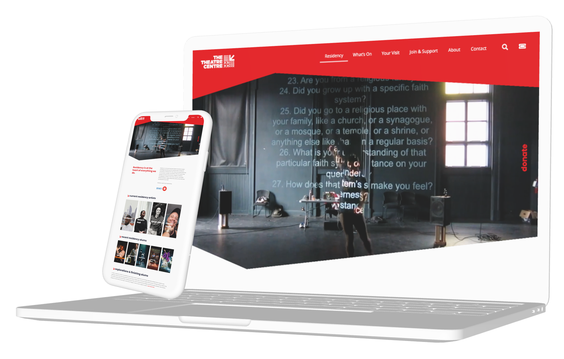
A digital home to invent the future
Launched in October 2022, the new Theatre Centre website has drastically improved the experience of all user groups from audiences, to neighbours, donors, and staff. Tickets are easier to find, the community feels more connected to the company, and staff and board members feel empowered to share the site with pride.
With a modern look, clean navigation, a calendar with search and sort functions, a scalable and easily updated show page template, and responsive design, the company’s digital home finally reflects its world-class reputation.


The Team
Our team included me, in the role of Designer and Project Manager, Theatre Centre staff across multiple departments including Alex Eastman (Producer), liza paul (Associate Artistic Director), Tamara Jones (Marketing Coordinator), board liaison and consultant Charlotte Davis, and web developer Owais Lightwala.
PLANNING
Timeline
Given the limited budget and the scope of the work, we knew this would be a long-term project.
We first met in April 2020 to begin planning. It would be integral to the completion of the project that we have a clear timeline with milestones throughout the year to keep us on track. The project was broken down into intensive design sprints with part-time work in between.
Phase 1 - Research & Planning
Phase 2 - Design & Content Creation
Phase 3 - Build & Test
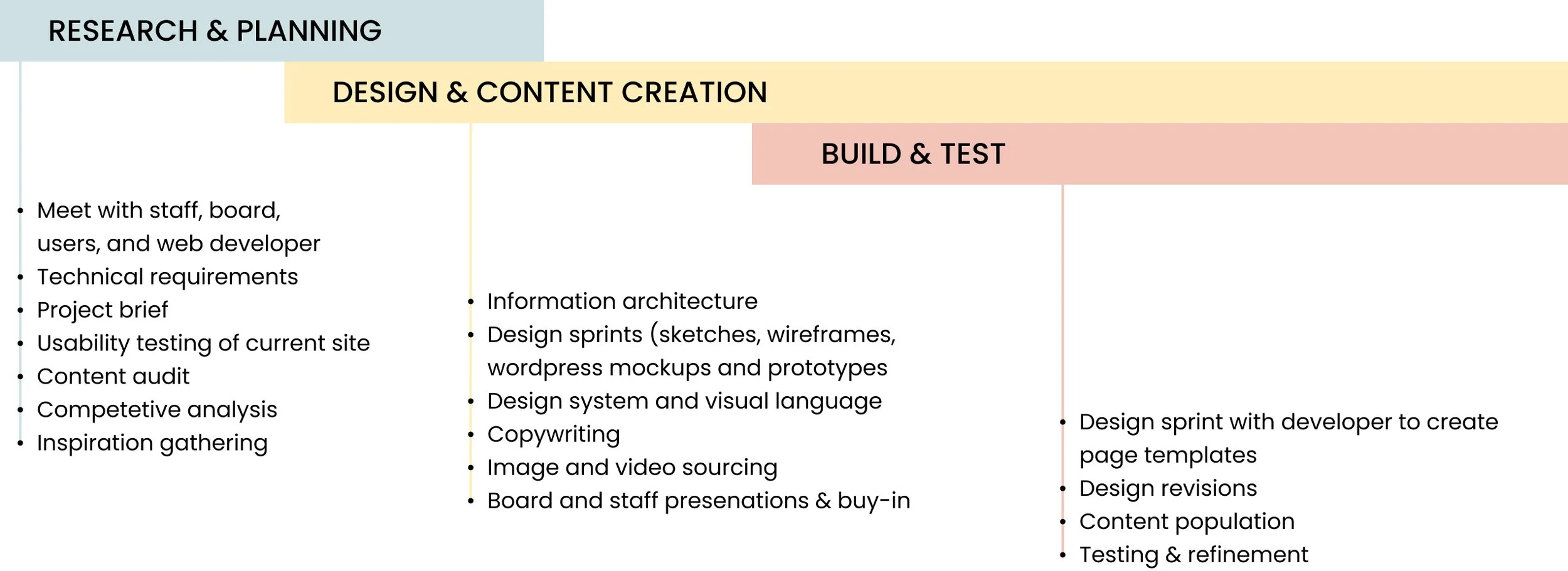

We set a launch date of October 1, 2022 to coincide with the 2022 Programming Announcement. In the final six months, the design phase overlapped with the beginning of the build. As we handed over design and content to the developer I’d meet with him to review what he built and provide feedback. Once template designs were locked he’d continue to build new pages while the theatre centre team populated sub-pages such as artist, show pages, and blog posts.
RESEARCH
Getting to know the cast
Since we as a team all worked at The Theatre Centre, we had a pretty solid understanding of what worked and what didn’t but I wanted to ensure we were making decisions based on the needs of the user and not what we thought was working or not. From the beginning, I prioritized speaking with stakeholders to better understand their goals and frustrations when visiting our site, as well as other theatres.
We interviewed a variety of users including ticket buyers, donors, board members, staff, cafe patrons, and neighbours. We asked about their level of involvement with the company, what touch points they’d interacted with in the past, and how their experience had been. We focused on three primary flows: ticket buying, making a donation, and learning more about the theatre’s mission and programs.
From these interviews, we developed a number of personas to represent the different user groups. This gave us valuable insights into the pain points people were currently experiencing and investing the time to understand the goals of patrons, donors, and artists rooted our decision-making in the needs of our users.


PLANNING
Technical Requirements
In developing the brief we set out a list of requirements for the site. This was informed by the interviews we conducted, input from staff, management, and the board of directors, as well as my own experience over the past five years as the Manager of Marketing and Communications.
General
Fast and reliable
Fully-responsive
Accessible
Easy to use Content Management System
Overall site search
Calendar
Both list and grid views
Sort function
Ticket Sales
Ticket sales/dates integrated with Theatre Manager (third party software)
Donations
Online donation form with the ability to pay online. (integrated with Theatre Manager and/or Canada Helps).
Donate button should be on every page
Blog
Ability to layout and format text and images in an interesting manner.
Ability to embed video and audio
Ability to tag and filter articles
Social share buttons
Archive
a functional way to save show pages and blog posts (from current website) so they can be referenced
Backend
Website keyword search
Integrated with google analytics and social media tracking (Facebook Pixel Google Analytics, etc.)
PLANNING
Key Objectives
Boost Awareness: Provide clear, detailed, and easy-to-find information about core programming as well as all programming and general information (shows/events/ rentals/ café/bar info)
Generate Ticket Sales: Enable people to quickly and easily find what’s on and to buy tickets
Create Community and Support: Inspire visitors to engage with and support The Theatre Centre through various means (donate, subscribe, volunteer, etc.)
RESEARCH
Inspiration
To gather inspiration we looked at other theatre companies in Canada and around the world, as well as music venues, museums, restaurants, and festivals.


DESIGN
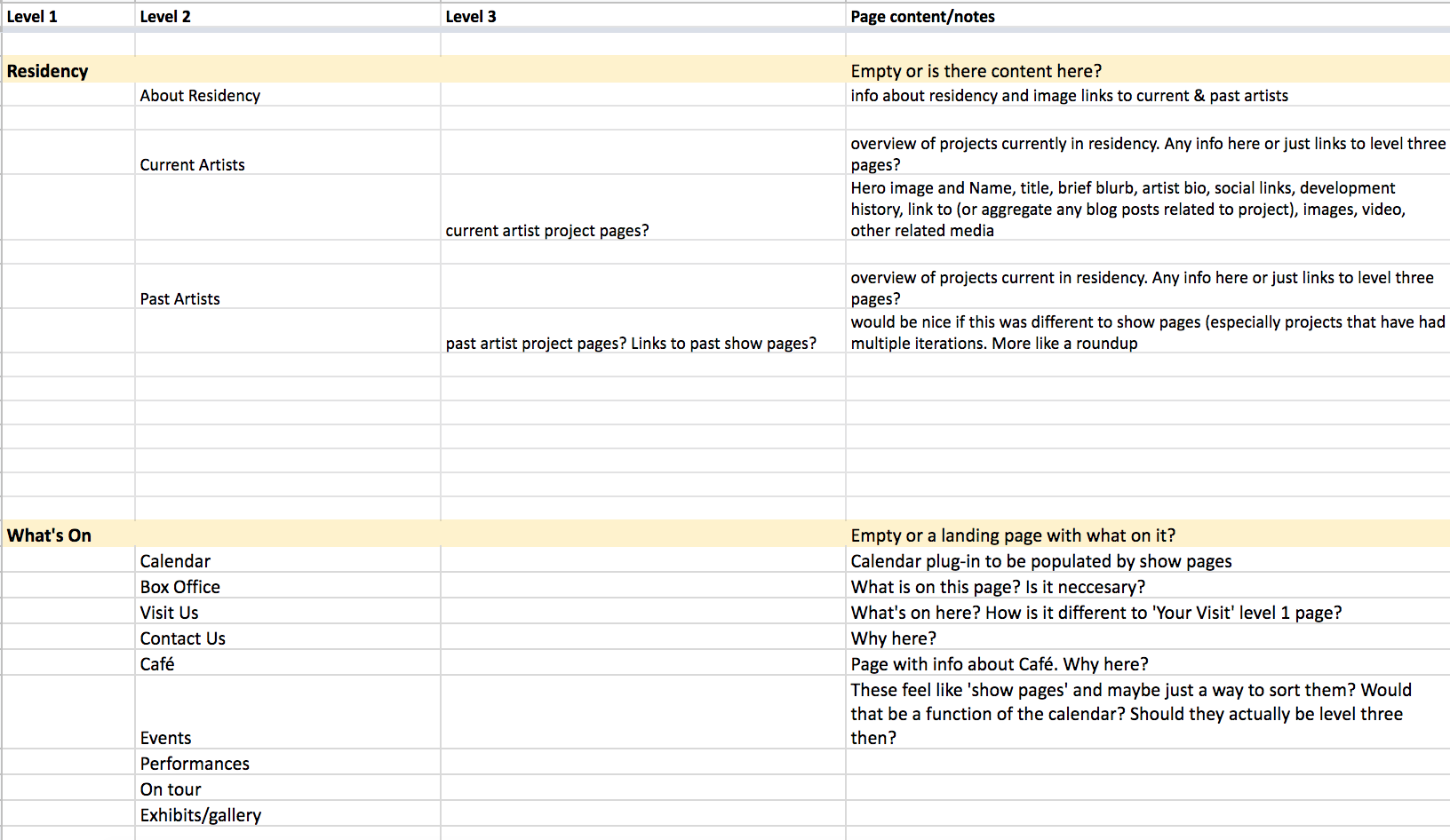
Information Architechture
One of the biggest challenges was overhauling the navigation structure of the site. The sheer breadth of what the company does, and the variety of needs of different visitors, made it quite the undertaking to determine what needed to be included and how it would be structured.
The existing navigation was unintuitive and actually buried the core artistic program — Residency. The nav bar was also getting bloated as new programs were added and there wasn’t a logical system for scaling in place.
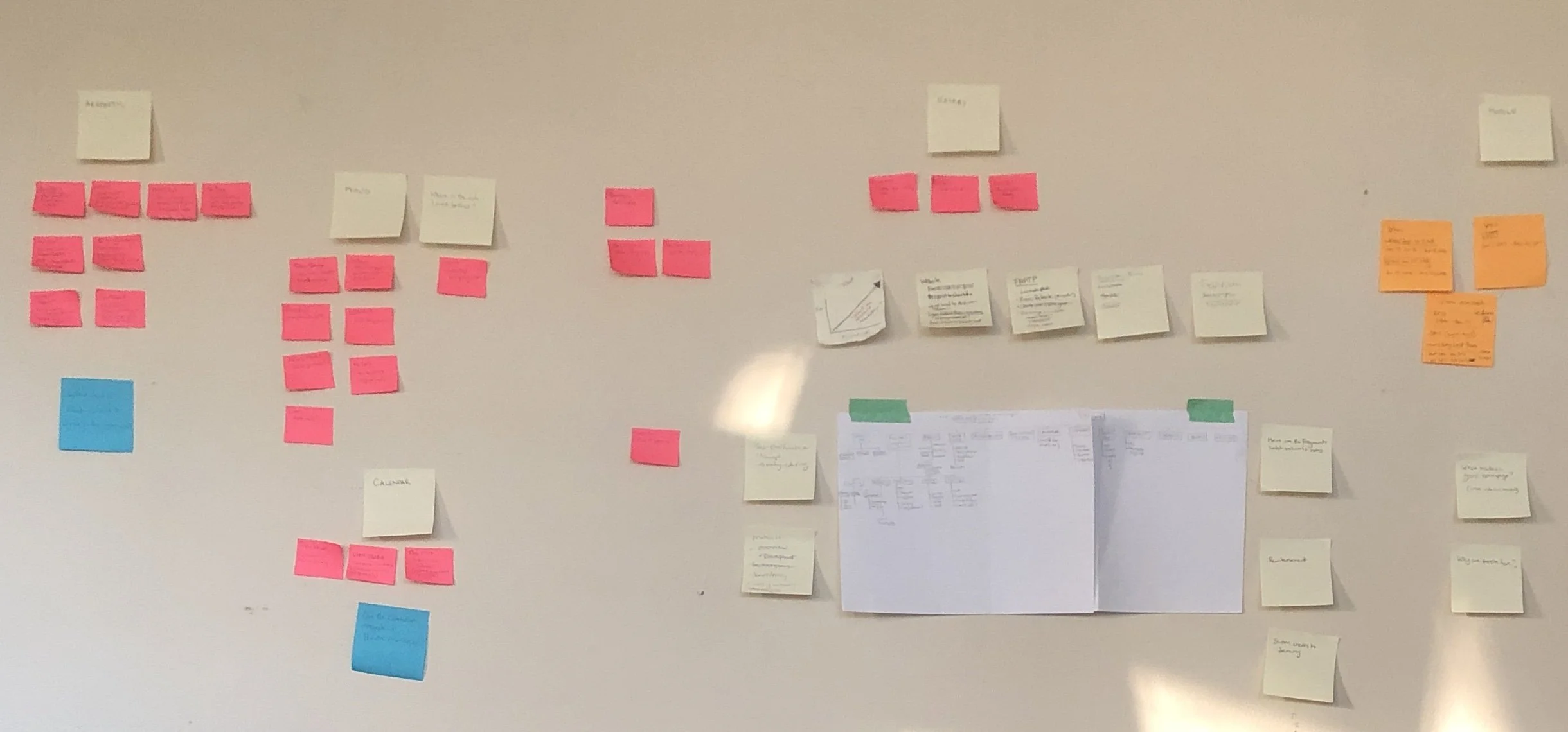
Our first step was to conduct a content inventory to better understand everything that the company did. We also did a competitive analysis to better understand how other arts organizations structured their sites. It was then an exercise in organizing, structuring, and labelling content in an effective and sustainable way. We iterated a number of versions, presented them to various stakeholders for feedback, and A/B tested the two most popular options to see what performed best.

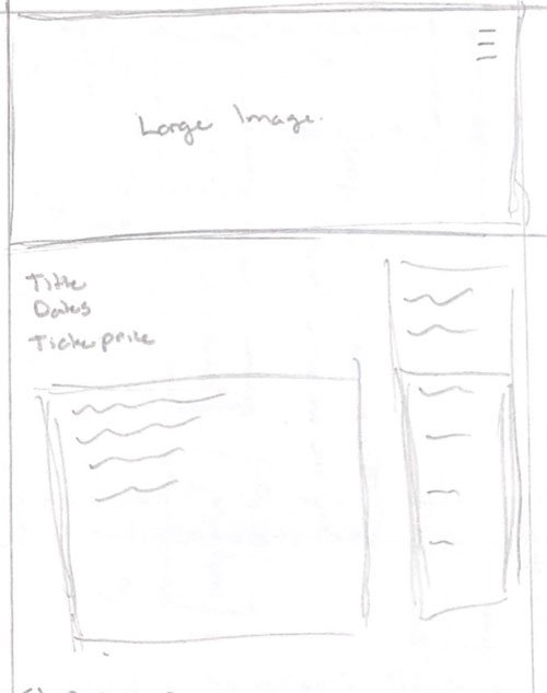
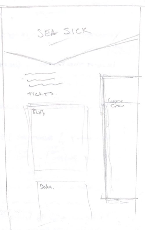
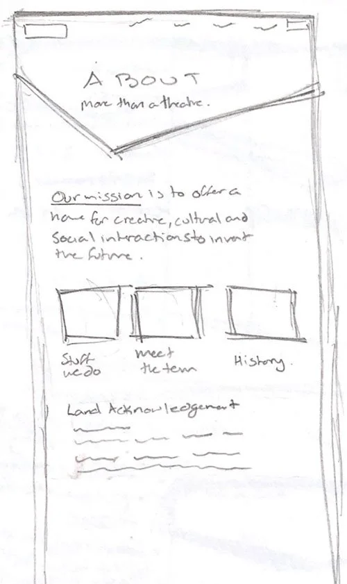
Sketching
DESIGN
With a plan in place for the IA of the site, I turned my attention to the design.
The site should feel welcoming and reflect the world-class calibre of the shows the theatre created.
The guiding principles of our design were:
• Clean & modern (lots of white space)
• Easy to navigate (through a page & across the site)
• Eye-catching imagery (show don’t tell)
• Work with colours and typography from the existing style guide
I started by sketching different versions of the main pages including the home, Residency, and show pages. From these sketches, I took to Figma to make wireframes. I then presented the different options to the team and the developer. Together we drew on elements from a few different versions and created a visual language for the site that would serve as a template for all the pages.


DESIGN
WIREFRAMES
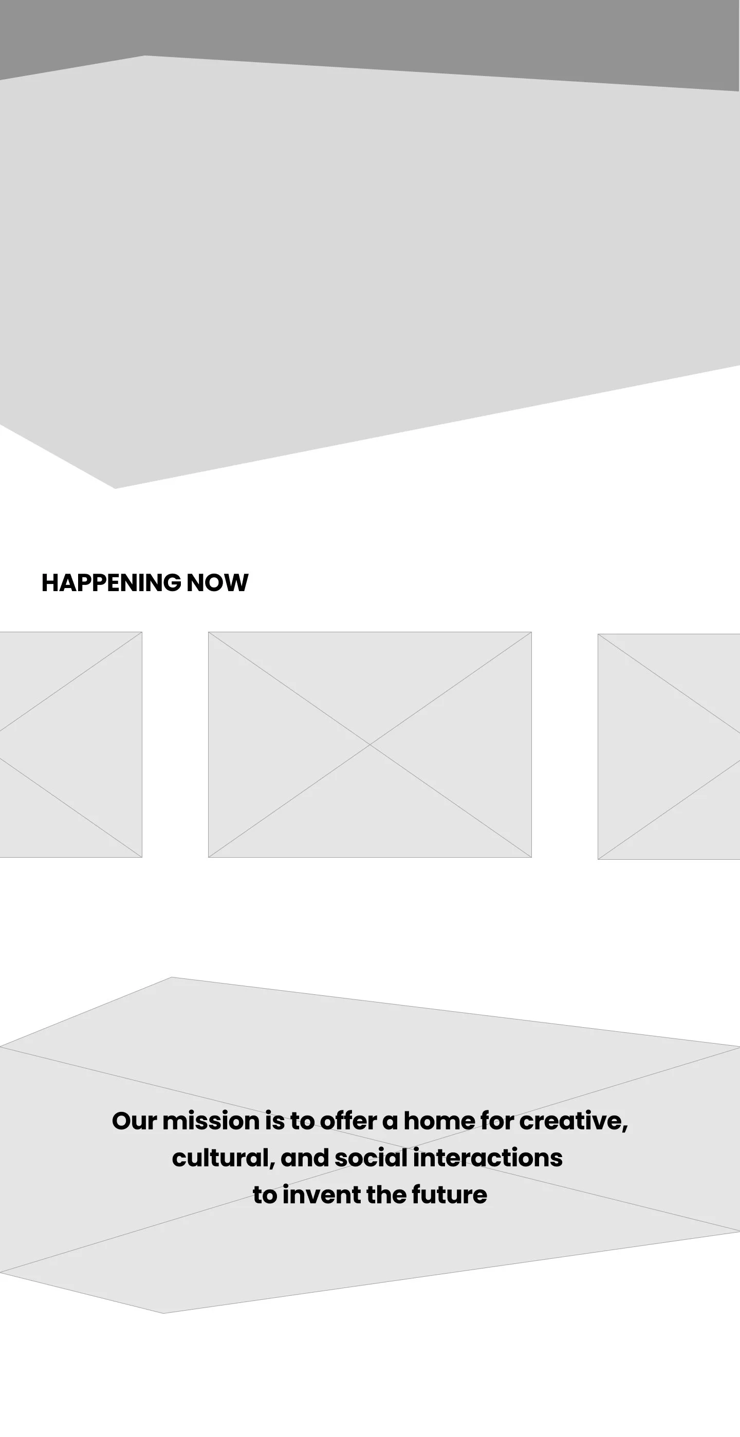

A major component of the design would be the hero image. Our developer suggested playing with the shape to incorporate the shape and feel of the arrows used in the TC logo. Rather than a hero image with a straight edge he built the page in Wordpress with a triangle at the bottom that would draw the visitor’s eye down the page.
Mockups & Testing
DESIGN
Working with the existing style guide, I created high-fi mockups to share with a small group of users for feedback and testing. We were still working out the IA and refining the top-level navigation so this stage of testing focused on the user’s journey through the mock-ups.


BUILD
Handoff & Testing
With the design complete, IA refined, and content creation well underway, I handed things over to the developer to build the site in WordPress. Like the entire journey, this was an iterative process. As Owais built pages, we’d meet to refine the design. Certain elements changed to work with WordPress, and we also found gaps in our content and copy that needed to be filled. Owais would then incorporate the changes and build another page, while we fleshed out the content.
During this process, I coordinated with the other departments to rewrite donor copy, cafe offerings, and rental space. The website team also worked to build out show pages and Residency archives.

In the lead-up to the launch, we conducted another round of testing on a beta version of the site. We asked users to complete the following tasks
Purchase tickets to an upcoming show
Make a donation
Request information about renting the incubator space
Based on the results I prioritized edits before launch and worked with Owais to refine the flow and improve the design to improve usability. I am proud to say we launched on time, coinciding with the announcement of the 2022/23 Programming, of which the “fresh new look” was a cornerstone of the announcement.
IMPACT
A Standing Ovation
The redesign received lots of great feedback: tickets are easier to find, the community feels more connected to the company, and staff and board members are empowered to share the site with pride. The success of the project is also evident in the metrics tracked, with more time spent on the site, a reduced bounce rate, an increase in online donations, and a decrease in calls to the box office for technical support.
I am extremely proud of the hard work everyone on the team put into the redesign. This was so much more than a fresh coat of paint, we completely overhauled the site and there was so much thought (and work) that went into making it happen. I also learned a great deal about the design process. Revamping the information architecture posed a major challenge, but investing the time to understand the goals of patrons, donors, and artists rooted our decision-making in the needs of our users.
Looking to the future, there are refinements to be made based on feedback from the live site and I look forward to working with the team to continue to improve the user experience.